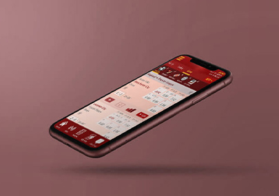
GlobeOne App
The new GlobeOne app lets you track your load and data, pay your bills, and subscribe to the latest promos anytime.
I gathered a small sample of 3rd party data, organized the topics, and distilled some recommendations for improvements on the product as a whole.
- Category: User Research
- Role: User Research, Competitive Analysis, Hypothesis
- When: 2022
- Status: Ongoing
Current Affairs: Globe vs Smart
As of 12 Sep 2022, the GlobeOne app has a 3.4 rating on the App Store with almost 7k reviews. It is 12+ years old and is currently on version 1.8.6.
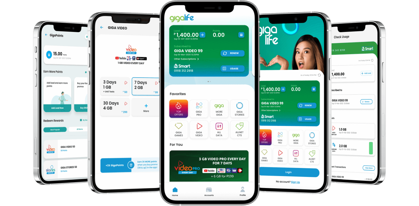
Its direct competitor is the Smart Giga Life app, currently on version 3.0.6, which has a 4.3 rating with over 34k reviews at 4+ years old.
Subscriptions: Globe > Smart
Globe has 86M subscribers compared to PLDT-owned Smart which has 71M subscribers. It would be interesting to see how these numbers stack up in the coming years with the entry of upstart DITO Telecom.
Postpaid & Prepaid: Globe ~ Smart
Whether postpaid or prepaid, it seems Globe and Smart have very similar offerings price and feature-wise though Globe offers more tiers for its postpaid offerings while Smart has more tiers under its prepaid surf-only promos. Smart also has more tiers under its new Tourist SIM product compared to Globe's similar product targeting the country's short-term guests.
Connection Speed: Globe < Smart
In terms of data connection speed (with stats provided by OpenSignal), Smart is a runaway winner when it comes to overall download speed, games app experience (based on latency, packet loss and jitter) and voice app experience. DITO, however, wins the upload speed test. Globe needs to improve on this if it wants to stay competitive.
Source: https://www.moneymax.ph/personal-finance/articles/globe-vs-smart
Higher App Store Rating: Better App?
Based on a quick sample of Giga Life's reviews, I noticed that users leave 5-star reviews regardless of whether they had a great experience or not. It is not normal human behavior to leave a 5-star rating then follow it up with 5 sentences of feedback. GlobeOne is not gamifying its App Store ratings (unlike Smart, it seems) which means their ratings would be lower but would reflect consumer sentiment more accurately. On the surface, it seems Smart's app is better with its higher ratings but after looking more closely at the data, the ratings gap is suspect to say the least.
Quantitative Research
I gathered a sample of 50 GlobeOne app user reviews from the App Store and came up with a taxonomy according to the issues raised, filtered between pros and cons. I also kept tabs on how often they were raised:
Pros
- Better UI compared to previous version, 26%
- Effort to unify Globe apps is commendable, 4%
- User willing to update rating if app is updated, 2%
Cons
- No live agent to talk to; chat support & phone support always routes to self troubleshooting steps / useless, 24%
- Reward redemption is worse in new app, 16%
- New app cannot get old data for conversion to points even if phone is registered, 10%
- Request to properly merge Globe apps (old Globe One, Globe Rewards, Globe at Home), 14%
- Promo extensions offered via SMS not available on new app, 10%
- There should be no need to re-register per new app version, 8%
- New app is slow, 8%
- Difficult to buy load, 6%
- Option to convert to GCash coins, 6%
- Error with under 18 filter, 6%
- Suffix input error, 4%
- Too much ads on the new app, 80% of display, 4%
- Suggests beta testing of app before launch, 4%
- Login error, even after reinstall, 4%
- Request to add more 3rd party providers to transact within app, 4%
- App updates/improvements are slow to come by, 4%
- Can't verify email, 4%
- App updates/improvements are slow to come by, 4%
- Can't verify email, 4%
- Globe hired cheap developers, 4%
- App is always down, 4%
- Cannot use a different Gcash account other than your original one, 2%
- New app cannot register prepaid wifi anymore, 2%
- Can't change the number of old registered prepaid wifi, 2%
- Lost all existing data, 2%
- Curious about app's security features, 2%
- SIM installed in tablet cannot get OTP?, 2%
- GCash transactions not working, 2%
- Worse experience renewing or upgrading plan in new app, 2%
- Option to add Huawei home devices, 2%
- Profile can't be completed, 2%
- No passcode/fingerprint/face id app lock, 2%
- No roaming supprt, 2%
- Only tech savvy people can use the app, 2%
- Cannot add account, view billing details after reinstall, 2%
- Migration to new app is not smooth, 2%
- Add Plan tab, 2%
- Bring back Globe at Home app, 2%
- New app favors prepaid subscribers, 2%
- Difficult to add accounts, 2%
Also, it is important to note that 56% of reviews had a reply from the developer while 44% didn't.

Gratitude
It's cool to see that 26% of respondents appreciate the aesthetics the GlobeOne app team has worked hard for, though it's more of a preface to a sh!t storm than anything. In fact, everything positive in a review should taken with a grain of salt and maybe also a bucketful of sarcasm. Users liked the effort to unify disparate apps? Thanks, that's the goal. User is willing to update her rating after the proper update? This is classic carrot and stick approach but the attempt at bribery is much appreciated. As makers of digital products, we need to do better, way better in fact.
Low Hanging Fruit: Dev Response
56% response rate is pretty low. The team needs to reply to as many reviews as possible and also needs to address customers by their names. With a bit of effort, we can make them feel that they are being heard by an actual human versus an auto responder. We're replying anyway so might as well do it better.
If we look at the reviews for the Smart Giga Life app, they pretty much reply to every review and their developer responses almost always include the name of the user who gave the review, making it seem more personal, which is a win for Smart.
Short URL for Globe Links
We may also need a shorter, more simple chat link compared to the current one shared by the dev response team. Reviews do not allow hyperlinks and text selection so the user would have to copy the link by sight. Not sure if Globe has its own short URL service, but this helps a lot in this instance. Globe can keep the short links the same basically forever while the actual links may be ever-changing. This pays for itself in my experience. If this ever comes to fruition, the company needs to come up with a short link strategy and nomenclature framework as these things can get unwieldy quickly.

22% of users say they have trouble getting help from customer service
We may need to revisit the customer journeys for CS since they seem broken in their current state, at least based on the reviews. Maybe our CS agents are overwhelmed with requests; maybe they just need additional training or better automation tools. We need to know.
16% of users say reward redemption is worse in new app
If the UX for reward redemption works in the old app, it simply should be replicated in the new app. Seems like a simple solution and there might be nuances in the new implementation but this is what needs to be done.
14% of users request to merge Globe apps (old Globe One, Globe Rewards, Globe at Home)
We need to revisit the JTBD of these apps and triangulate with the current feature set and product roadmap. It seems that different teams developed the above-mentioned apps; when it comes to forced synergy, some teams are more open than others. If you thought tech was difficult, you haven't worked with people yet. Outreach and humility is most important. BDO has the same issue with its apps so Globe is definitely not alone in this regard.
10% of users say the new app cannot get old data for conversion to points even if phone is registered
Let's try to replicate the error; sometimes certain bugs have already been fixed in the newer releases. If the error still exists, we can get the developer/s to flowchart the logic so we can all try to understand how the issue came to be. Also, explore the possibility that this issue may be related to the rewards redemption issue above (16%).
10% of users received promos offered via SMS not available on new app
We need to deploy promos and/or features ahead of the SMS/social media blasts. 1 week is fine. Always do a beta blast to catch spelling/grammar and/or link errors. Use short links if possible.
New app is slow, 8%
Is the app bloated, code-wise? Are we trying to load more data than needed? Are the graphics optimized? Are the CDN servers nearby? Does the app check for internet connectivity and display a prompt when it is below the minimum required speed? "You are currently running on GPRS; your transaction might take a while..." Long term, how does the development team plan to solve the speed issue?
Difficult to buy load, 6%
The user flow may need to be revisited. Also revisit old app and research the competition.
Option to convert to GCash coins, 6%
Study GCash coins. How else can we expand GCash coin utility?
Too much ads on the new app, 4%
Revisit and rethink the design. Do we really need to make ad revenue off of app users? Imagine your favorite banking app with ads; how do you feel about that? Maybe do a quick SWOT analysis on ads in mobile apps.
Further Finessing
A lot of the feedback could be finessed further by asking "why" though that would be difficult to do given that Apple does not share user data. This is where the chat link would be a viable path to open a direct line of communication with the user.

Conclusion
It seems the app's good visual design is getting dwarfed by various usability issues, with the top 3 being:
- Getting help is burdensome.
- Reward redemption is difficult.
- Globe apps should merge. (Switching from app to app is not a great user experience.)
#1 is quite complex and has a lot of moving parts but I think even a minimal improvement would have an immediate positive impact on the user. Online retailer Zappos is a great example of a company with topnotch CS which made customers stay loyal regardless of price. I feel that CS is generally not good in most places so a discernible improvement will surely mean good things for the company, especially in the medium to long term.
You could argue that #1 is neither a usability nor an app issue; it's a CS issue. But let's not forget that part of the overall usability of a product is not just the ease of use of the actual product or gadget but also the ease of access to help, especially when you get stuck and can't move forward. I haven't tried shopping at Zappos but imagine purchasing from them knowing that no matter what happens, you won't get screwed over? That's almost unthinkable nowadays with the rise of ecommerce and all its wrinkles.
Lastly, we need to repeat the process using Android data. Results may vary but I reckon the top Android issues will be very similar to iOS.
 Various Circles