Entertainment Platform
SB is an entertainment platform with a robust admin system which takes care of everything from account creation to setting usage limits, from admin permissions to report generation.
I was tasked to design the entire interface and user experience of the consumer-facing product and improve the look of the admin section. This includes the main interface, the equivalent of the shopping cart called the betslip, and all reports. I created prototypes for both desktop and mobile and produced all the graphics required by the front-end developers.
- Category: Design
- Role: UX, Visual Design, Prototyping, Illustration
- When: 2019 - 2021

Competitive Research
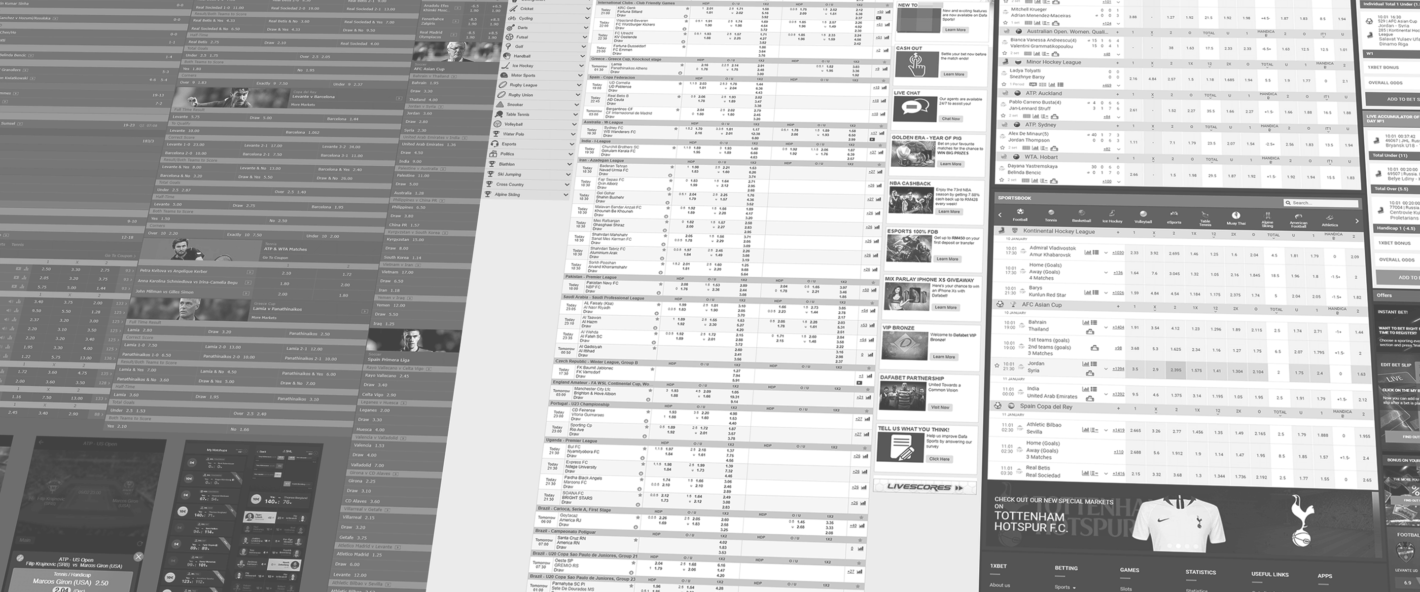
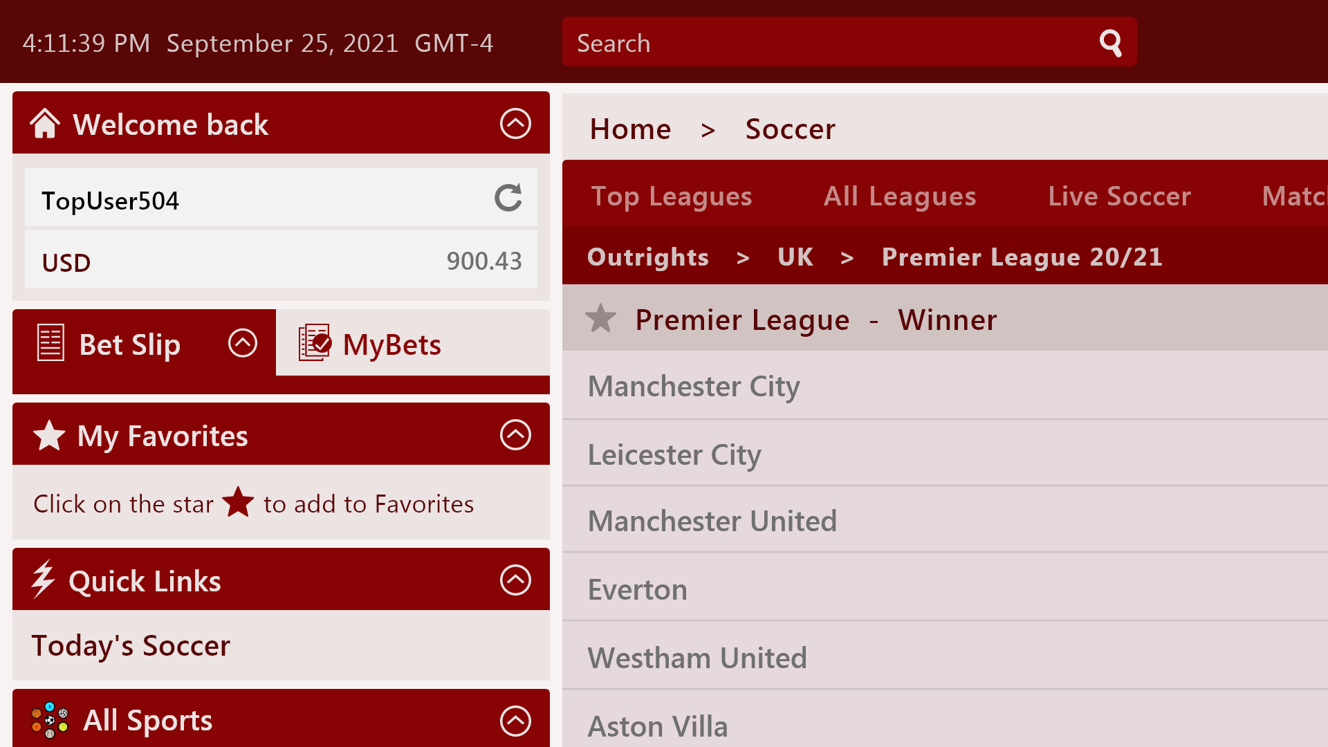
Sportsbooks historically have always been information-dense. It's all about making use of the available screen real estate to show more data. It can be overwhelming to the casual user. Regulars though, especially from certain locations, see it as a sign of disrespect if there's way too much "breathing room". To them, more data means more chances to make money. Asians generally are used to Excel-looking interfaces while Westerners appreciate a bit more white space. We're aiming to strike a balance between the two for our product.
User Personas
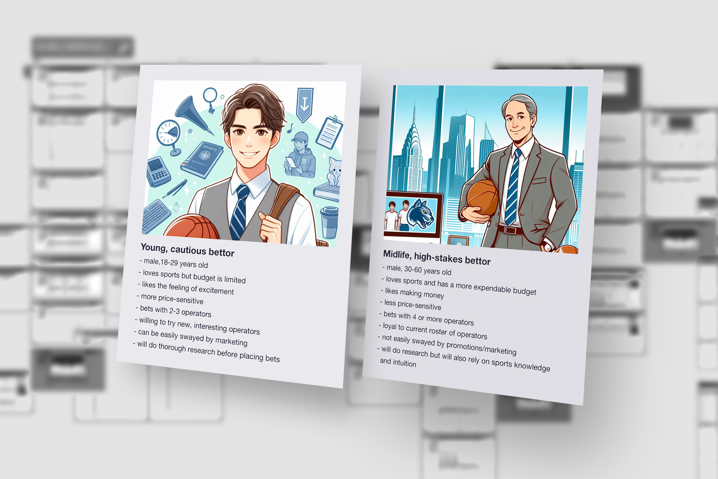
Personas allow us to anchor our decisions based on what our users would do. For our platform, we decided to set 2 personas: 1) men 18-29 yrs old with low brand loyalty + with limited budget and 2) men 30-60 yrs old who tend to be less elastic with their brand affiliations + with more disposable income. Having these personas allowed the team to keep the user top-of-mind throughout the sprint.

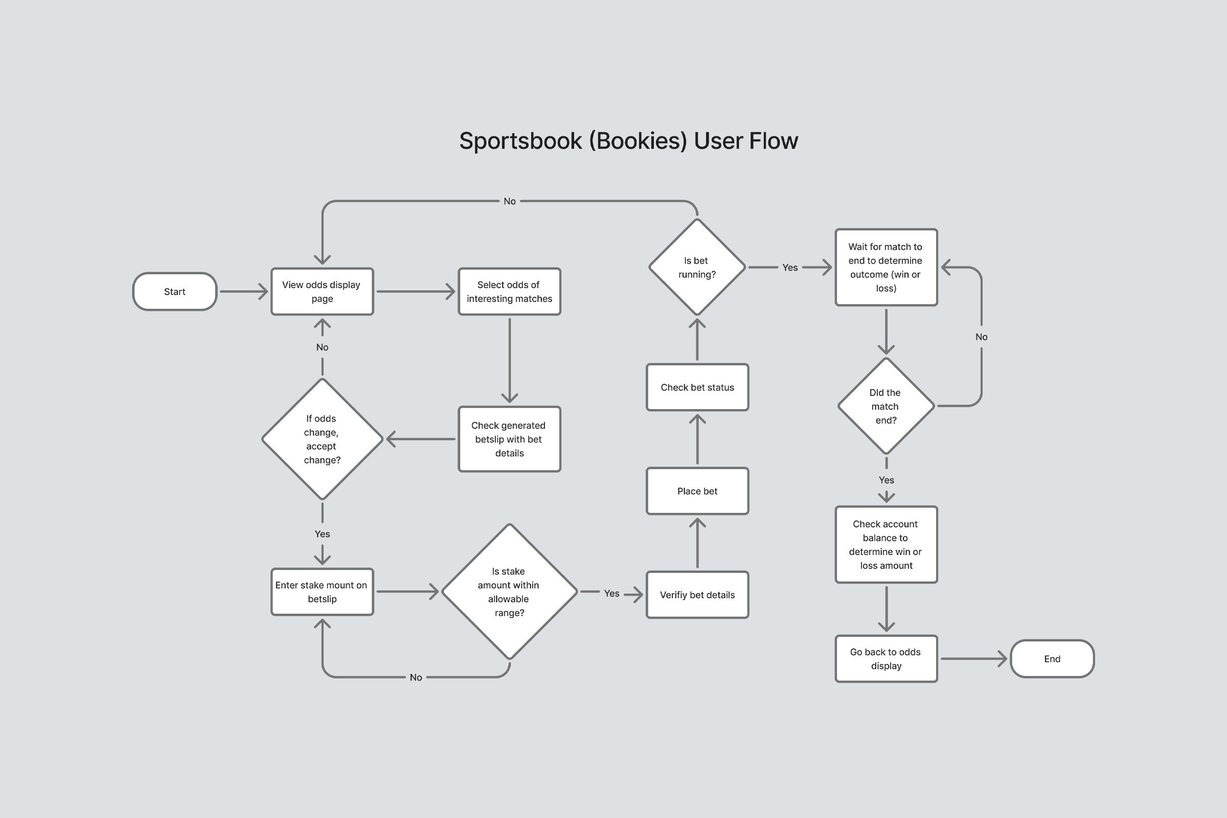
Details in the Wireframes
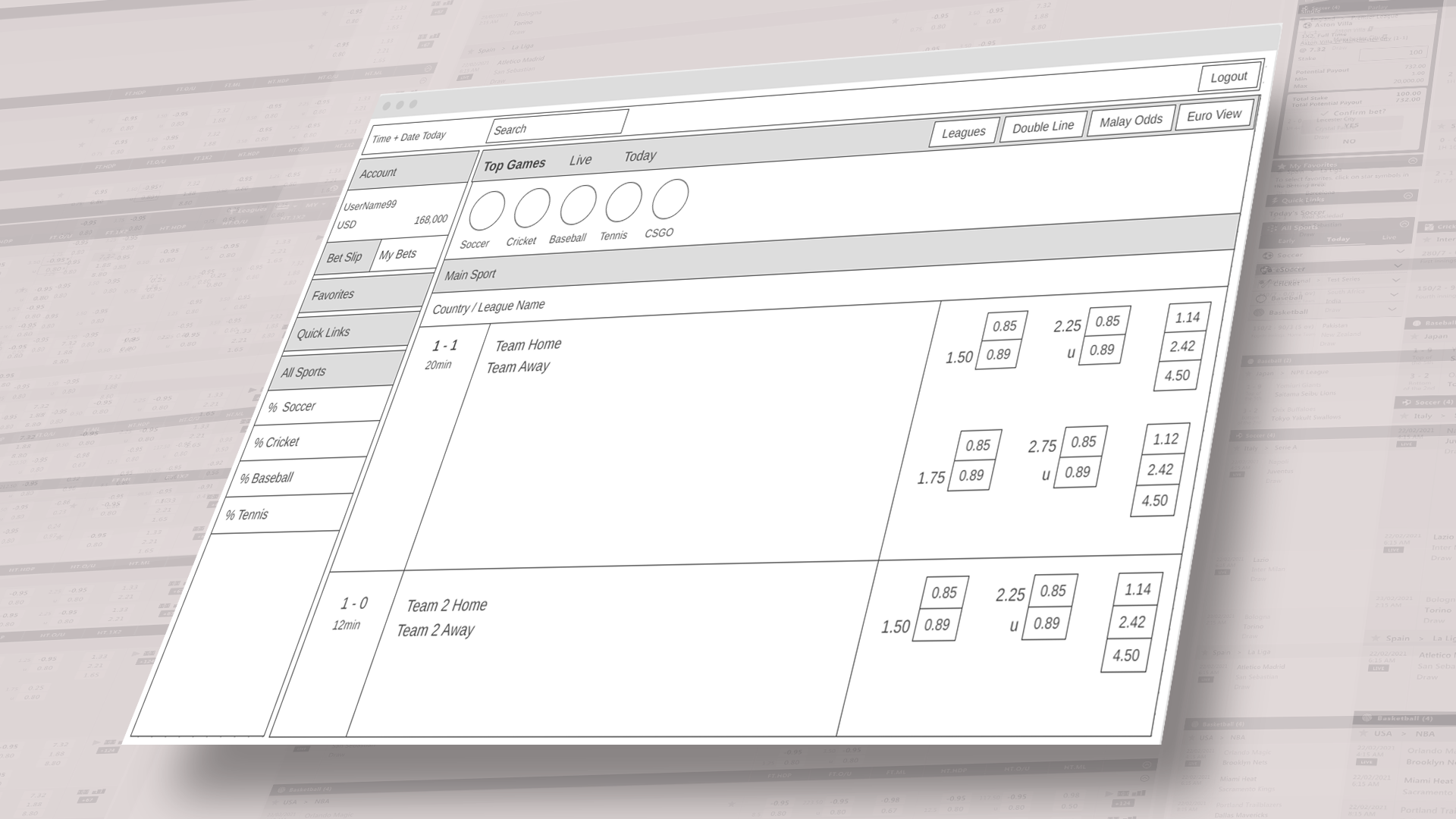
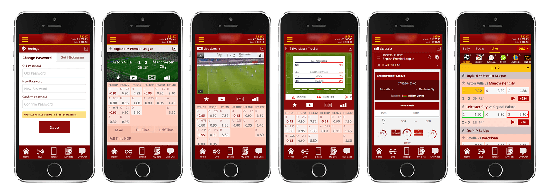
There is a lot of nuance in designing for such a product. While some users prefer familiar, time-tested UX patterns, most of them are not averse to innovations that allow for improvements on the product. We built multiple ways to view odds depending on your preference of market, sport, or location. Competitors are vigilant to maintain feature parity as most sportsbooks are in constant pursuit of better features and better user experience.
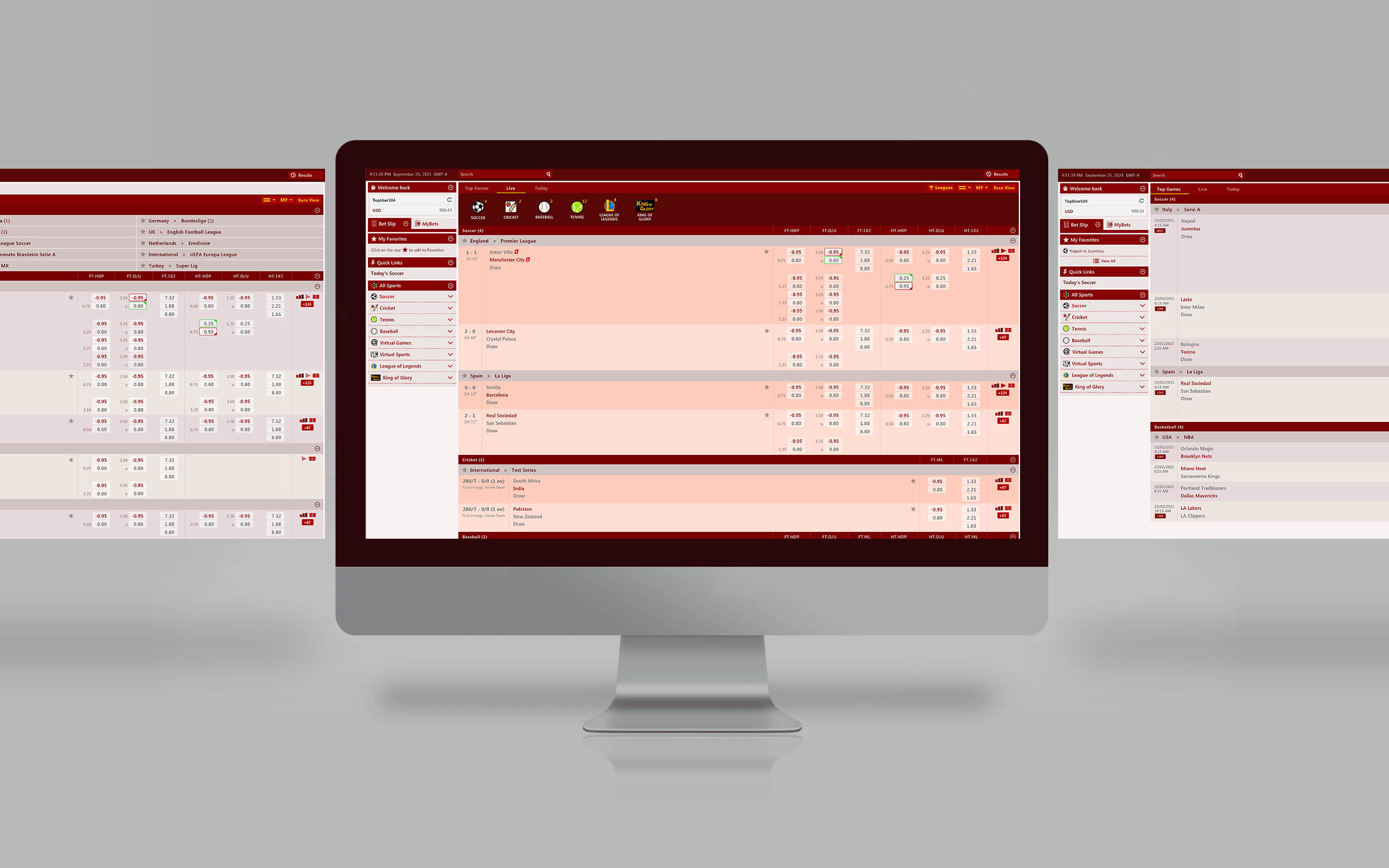
Desktop, then Mobile
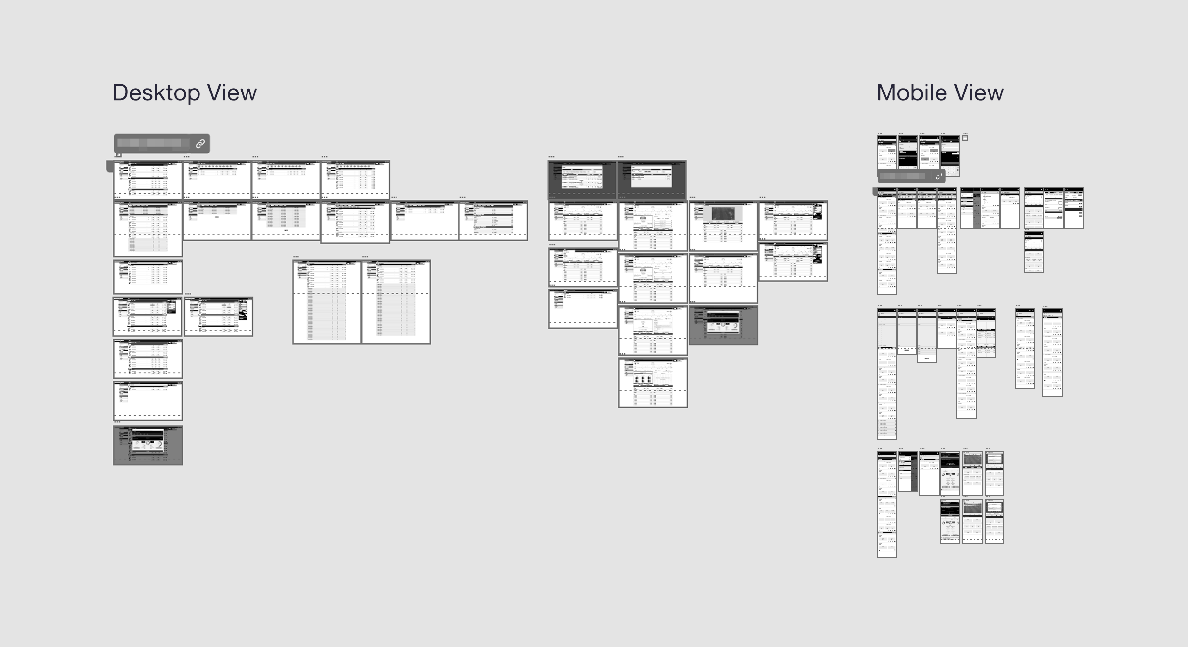
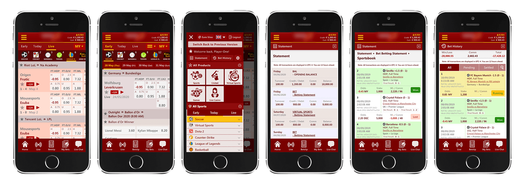
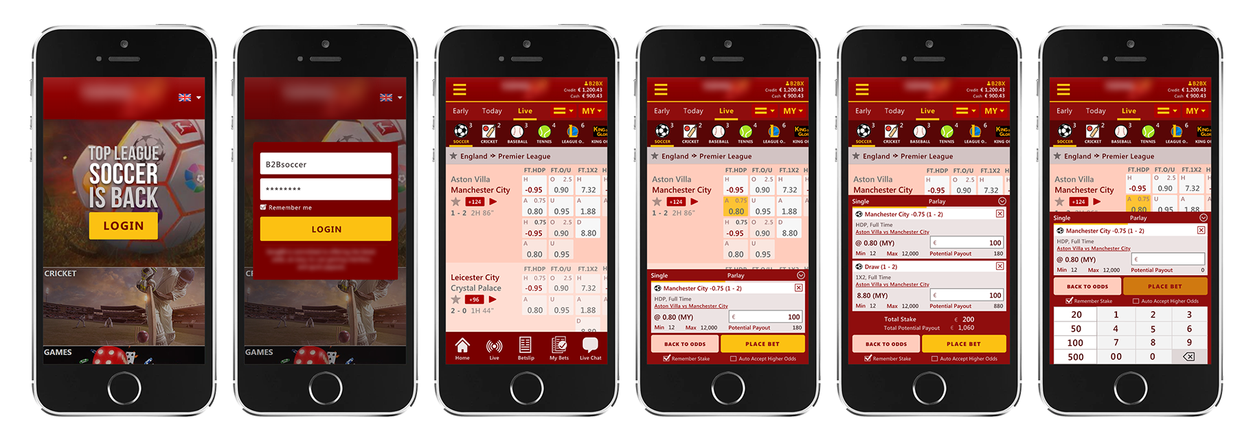
We initially focused on the desktop experience since most of our initial clients were power users who accessed the product on desktop; they appreciate seeing more options (on bigger real estate) and are therefore better informed to maximize their choices. After we launched v1 and saw usage statistics, we decided to develop the mobile experience to better serve the serious mobile user and capture the casual, on-the-go user.
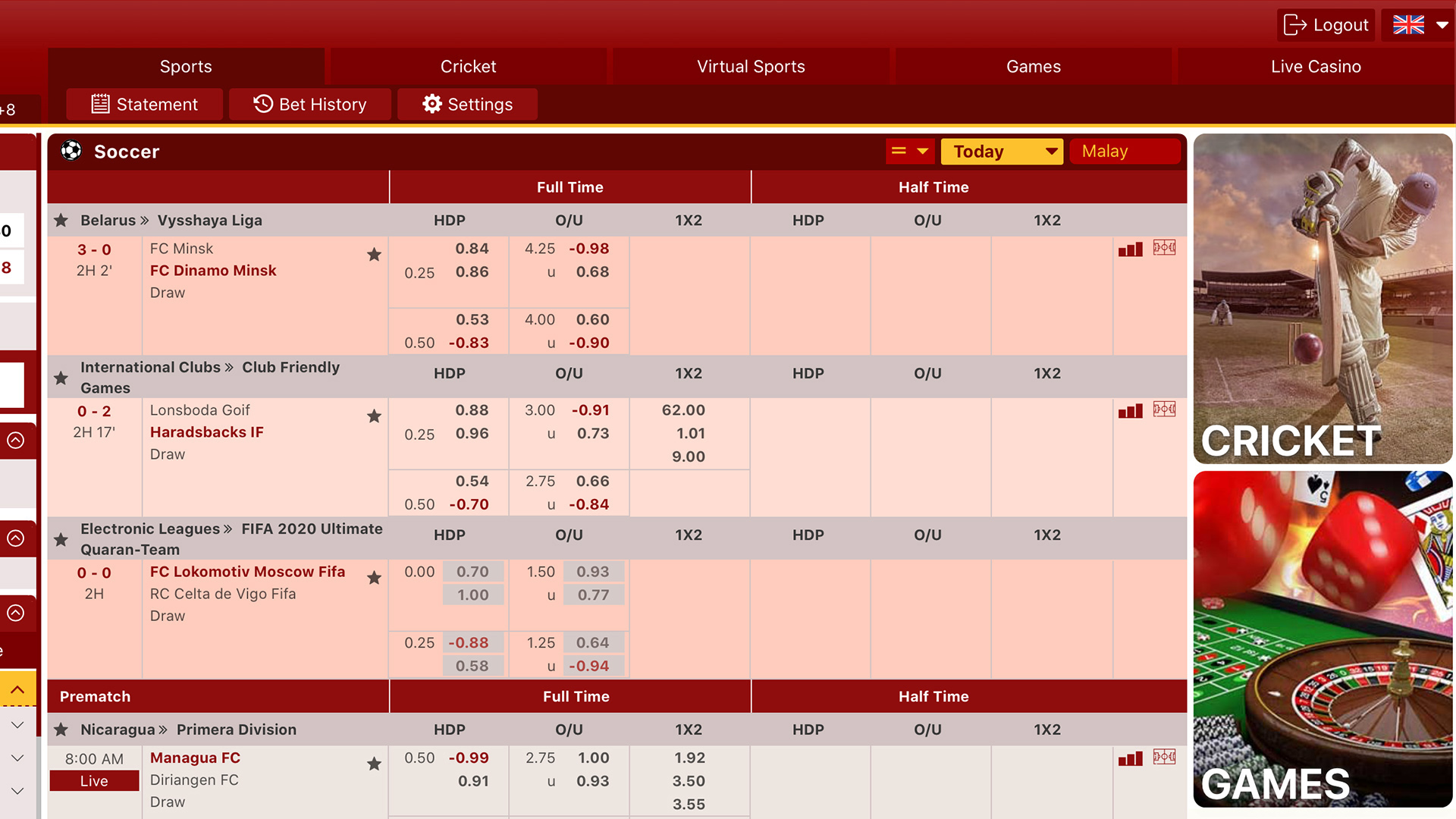
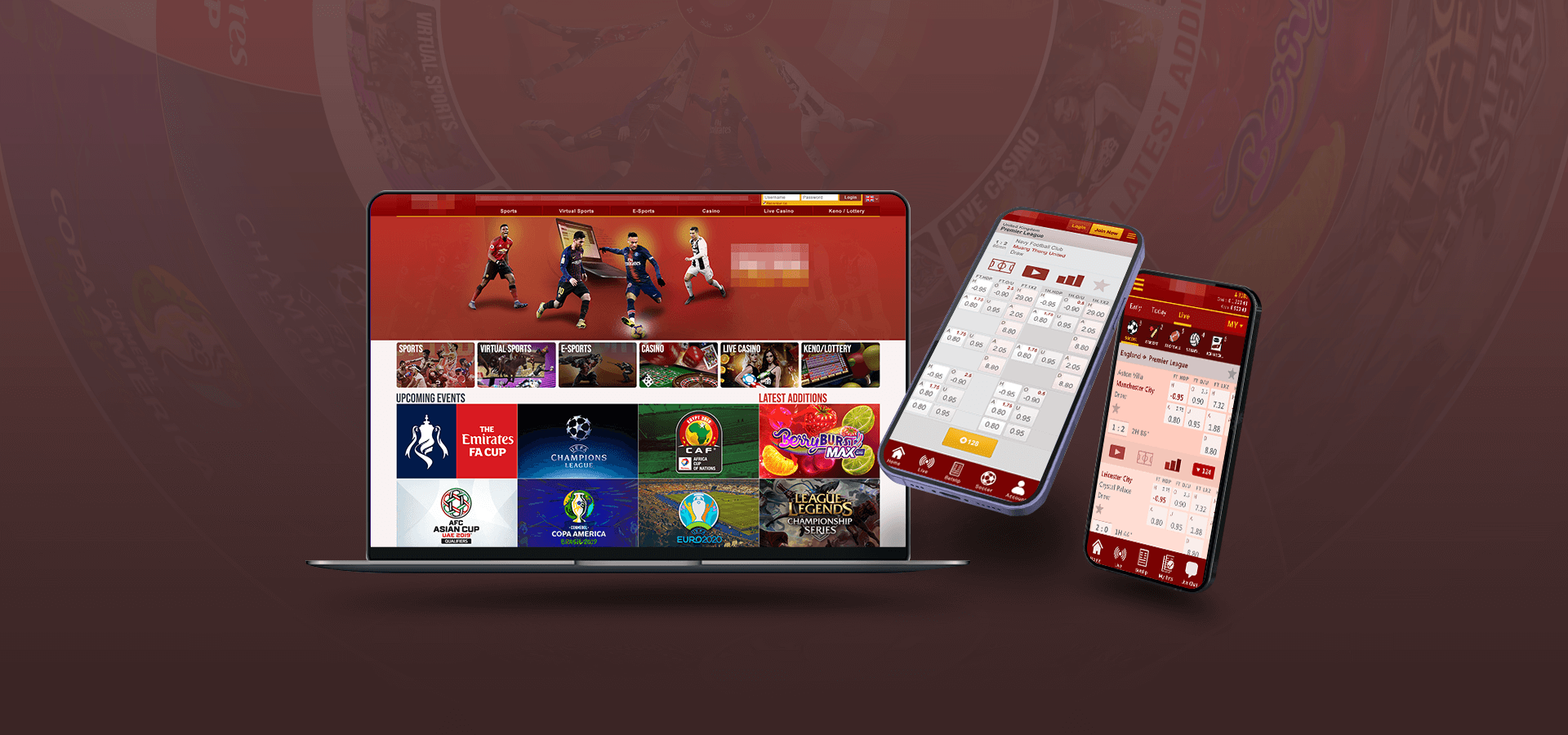
Homepage Refresh
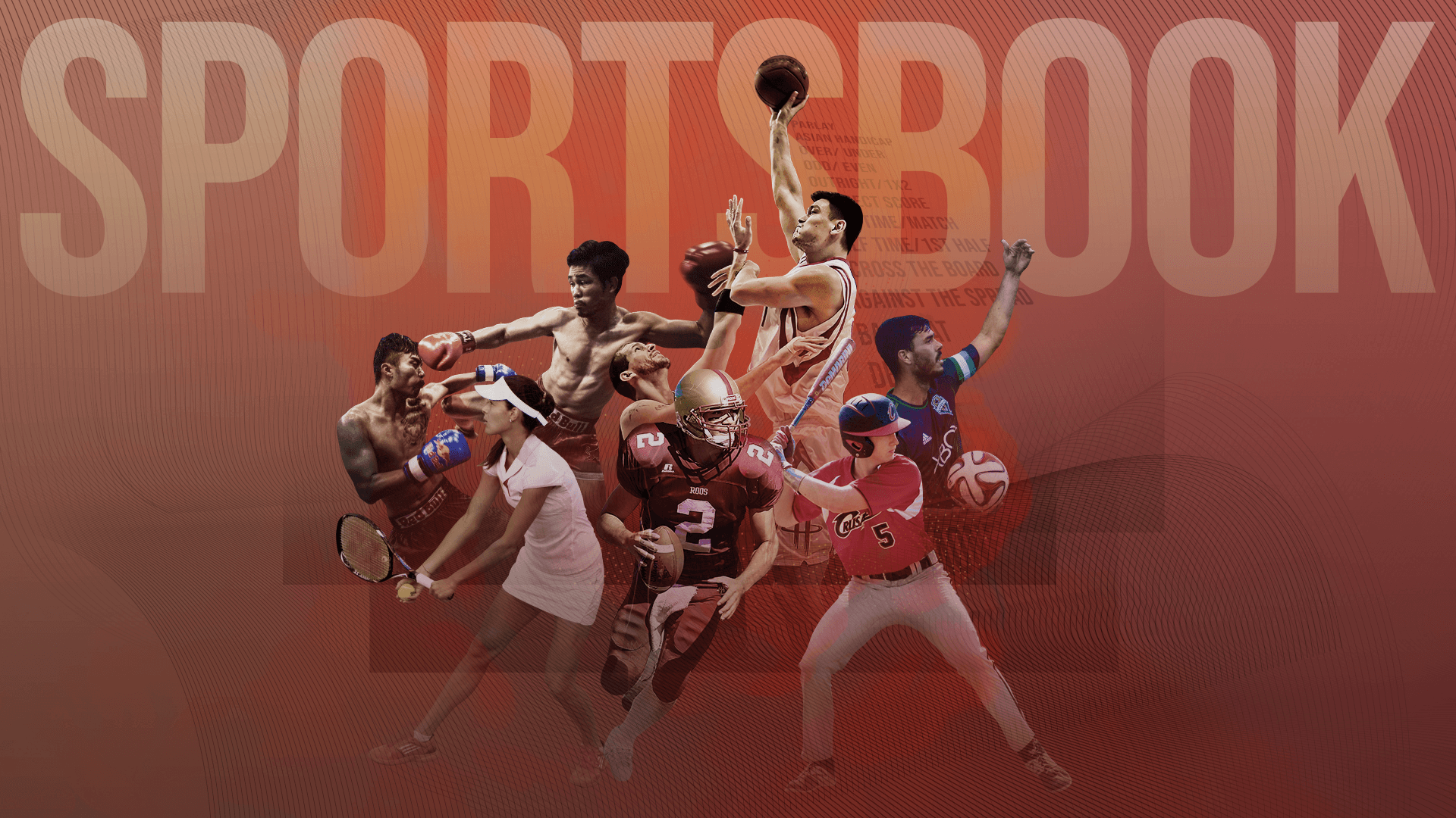
I pushed the idea of doing a refresh almost monthly to the product owner to keep up with upcoming sports events thus making the homepage more interesting. It's never difficult to imply action and dynamism with the use of sports-themed imagery. We then added a CMS feature for the homepage so the web administrators can do the updates themselves.
Products Illustrated
I also did some marketing graphics for the other product categories we had on offer. I used a lot of stock imagery alongside the product images from our software/game partners. I wanted to capture the dynamism of sport to carryover to the other products which are less physical in nature but no less entertaining.
Iconography
The use of icons in interface design can never be understated as people tend to have "text fatigue" after even a short time of browsing through text-heavy displays. Icons provide visual cues that allow for quicker scanning of content, especially for navigation, so users can get to their content faster. I've created dozens of icons for the client-facing UI and a few dozen more for the admin section.
Embodying the User
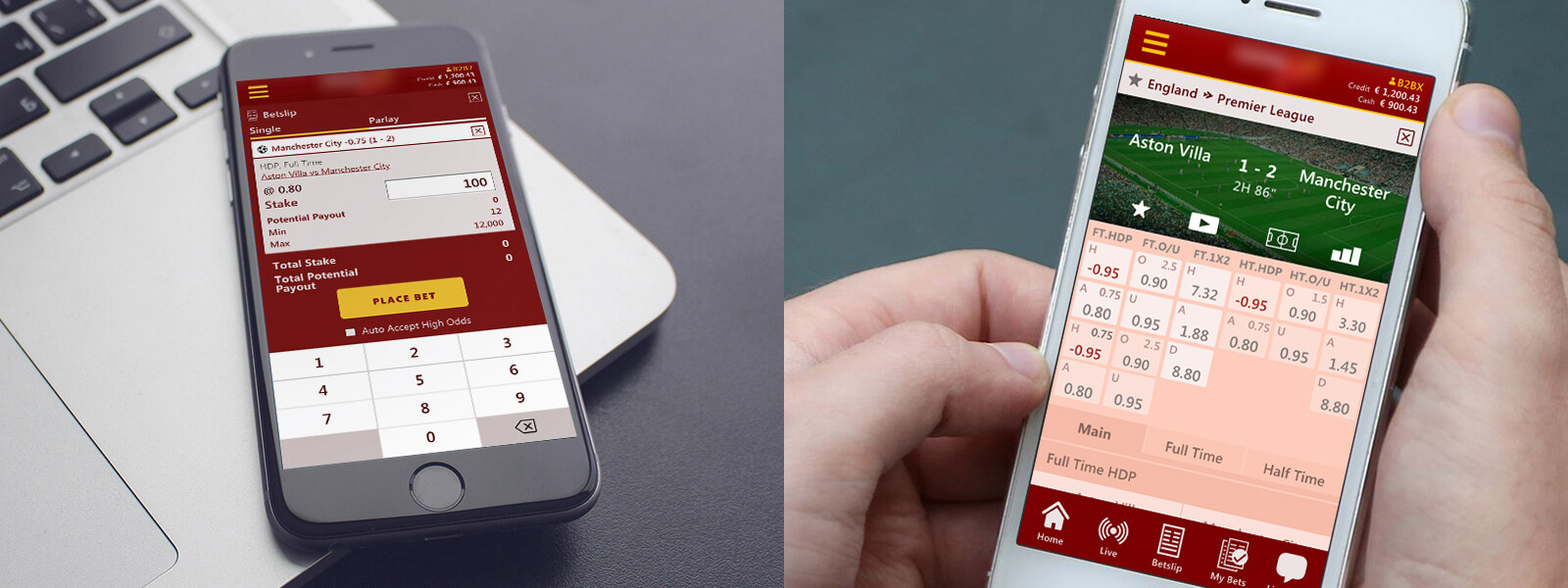
I constantly use the product to see if there are details which can incrementally be made better; this may include spacing, icons, colors, text, user flow, words. Big revamps or complete redesigns may be sexy, but it is in the small and constant tweaking where I think products really evolve and increasee their value to the customer in the long term.
What I Learned
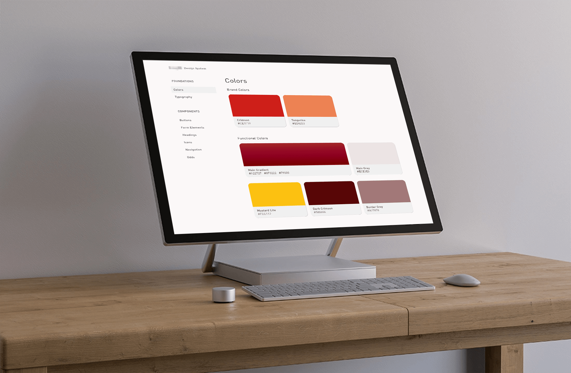
I learned about thinking in terms of systems. This nudges a designer to always consider the macro while tinkering on the minute details. This allows for easy reuse of existing patterns which make the product more put-together visually; once the components are in place, it's easier and faster to scale up with additional elements, components, sections, or screens that the prototype may need. Down the line, this also allows developers to focus less on additional styling as most of the styles already exist, with new components more easily incorporated within the existing system.

 Various Logos
