
ArenaPlus
Redesigned the wallet for ArenaPlus, a Philippine-based online sportsbook. I designed both light and dark mode for the iOs app.
- Category: App, Interactive
- Role: User Interface, User Experience, Visual Design, Art Direction
- Tools: Figma, Photoshop, Illustrator
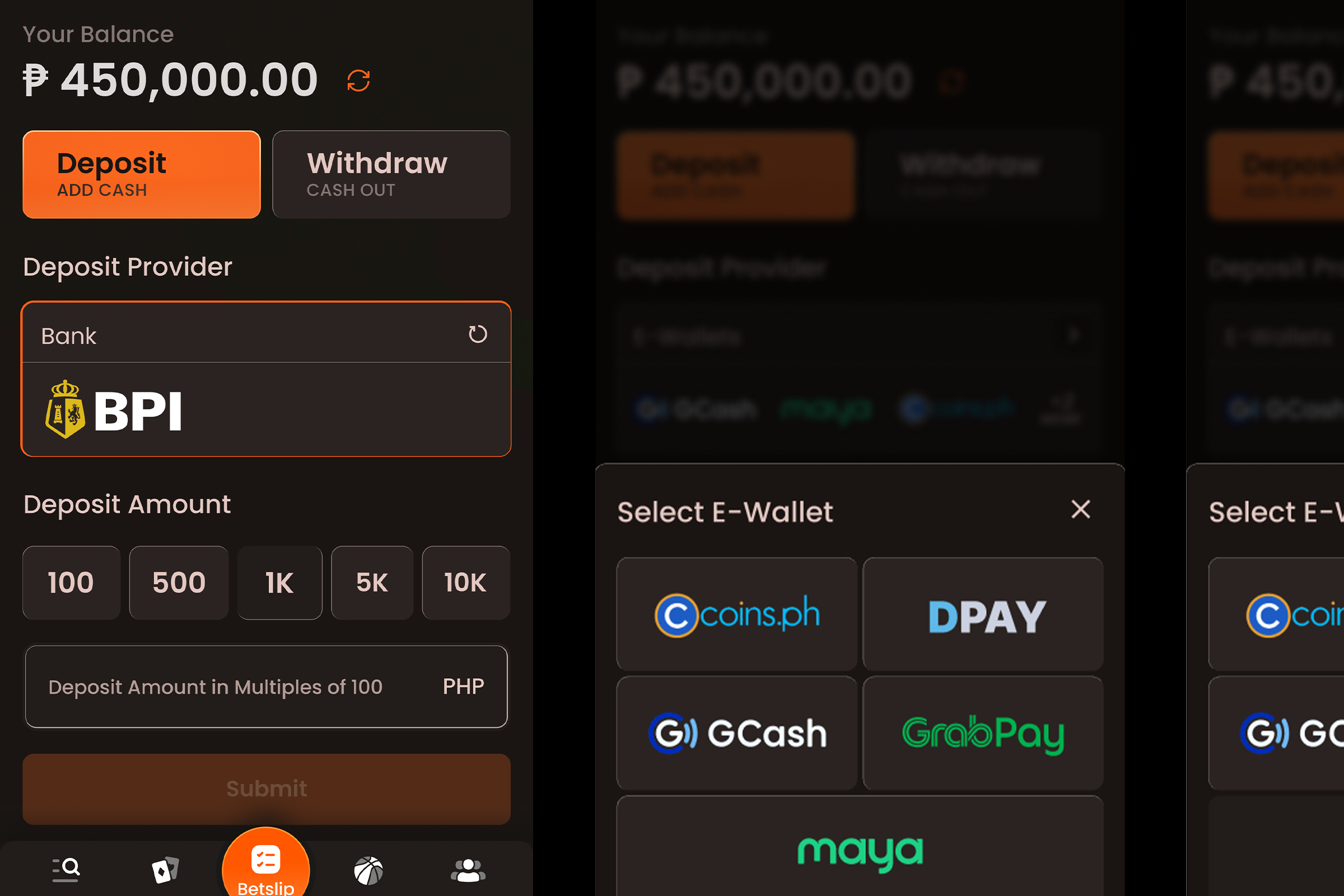
A Fresh Start
ArenaPlus was started in 2023 by gaming behemoth Digiplus as its sportsbook platform and a welcome addition to its burgeoning gaming portfolio which includes BingoPlus and CasinoPlus. Today, ArenaPlus is one of the fastest-growing and most trusted Philippine sportsbooks. And it is up for a redesign, which is where our team comes in.
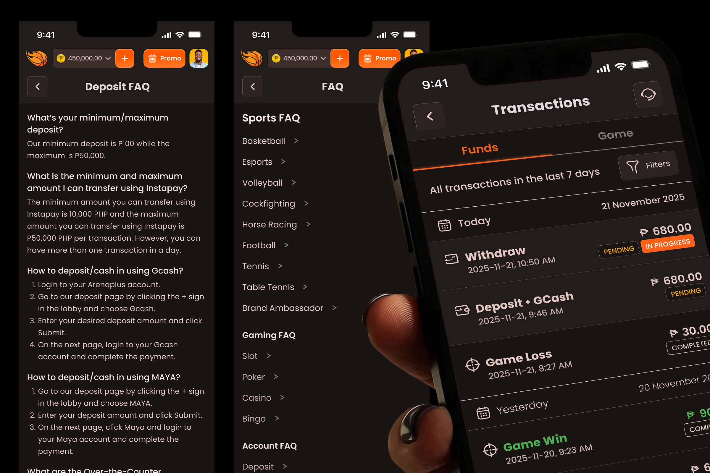
Keep it Simple, Make it Easy
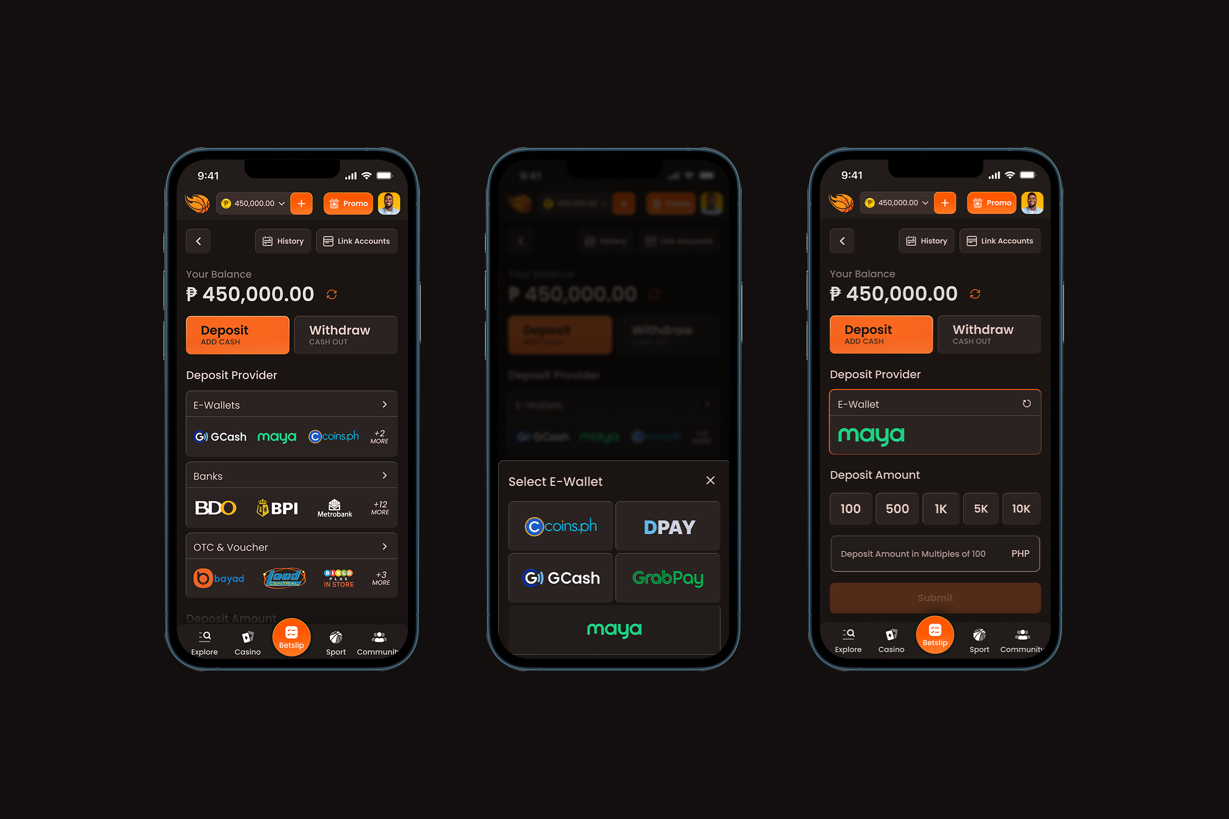
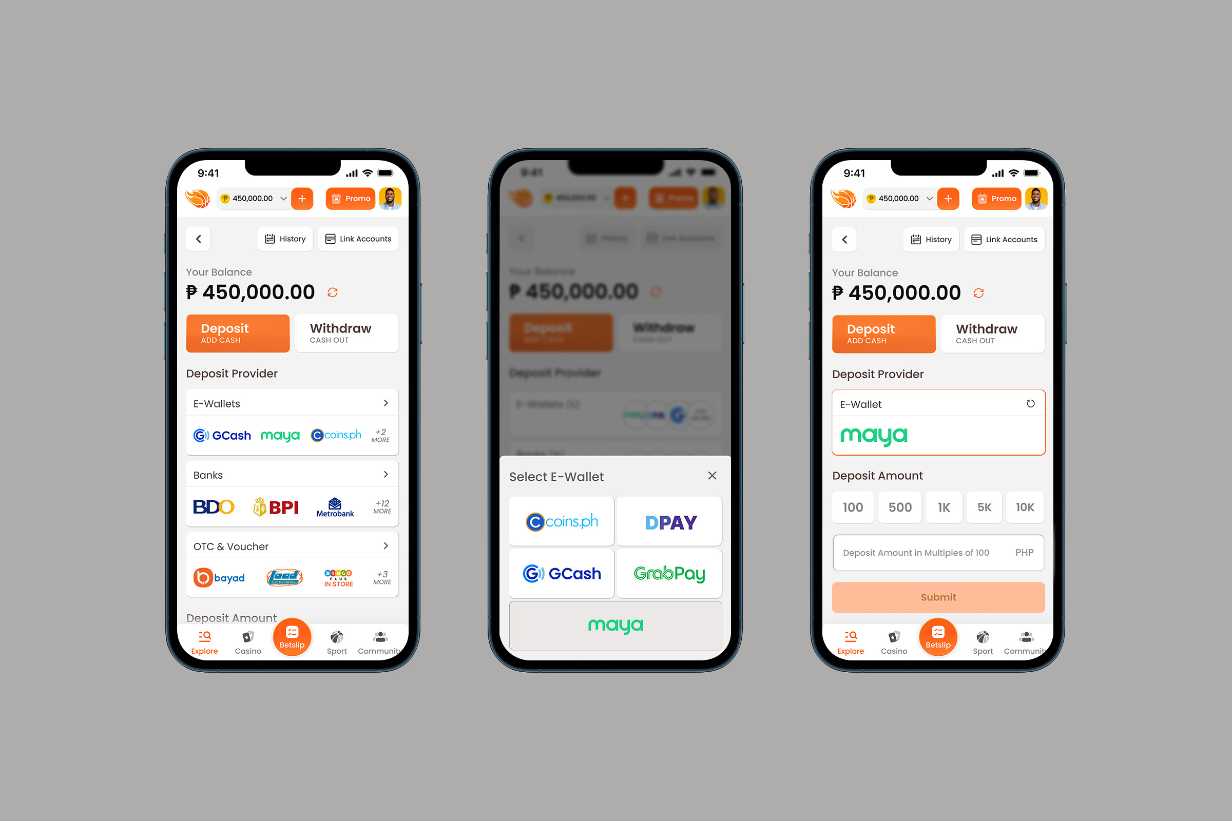
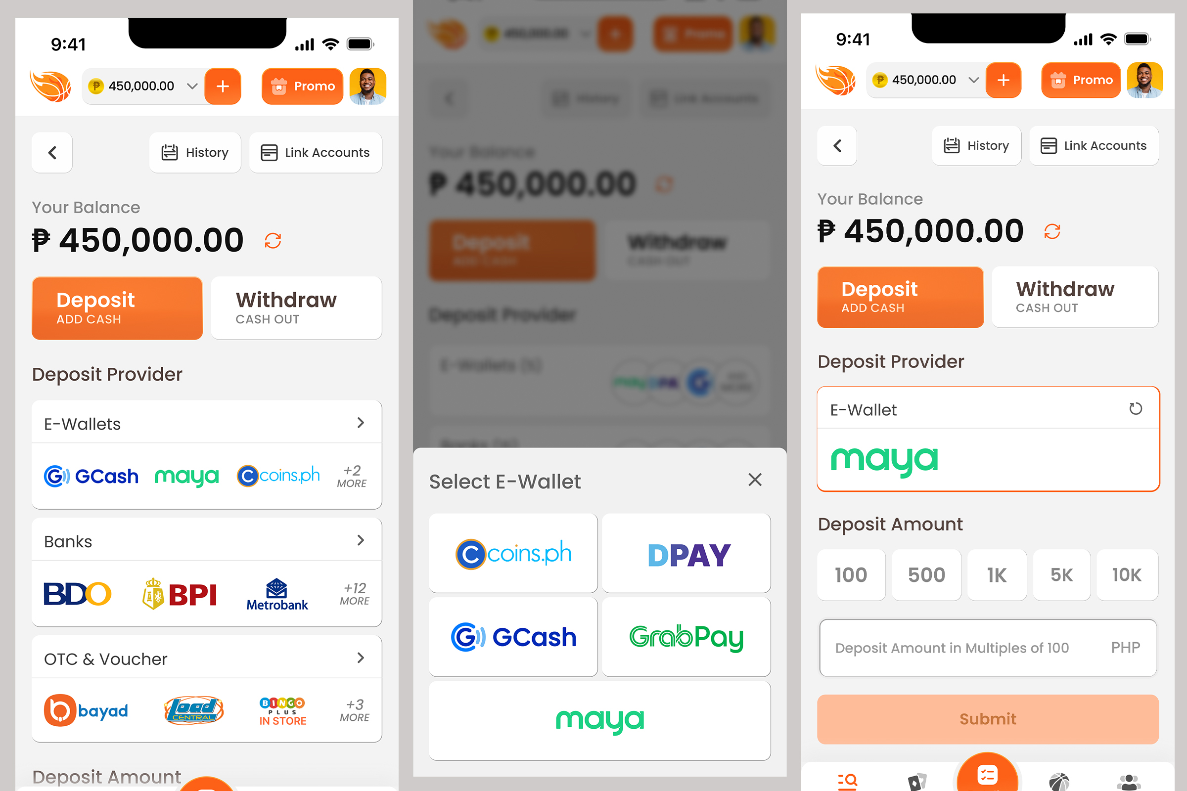
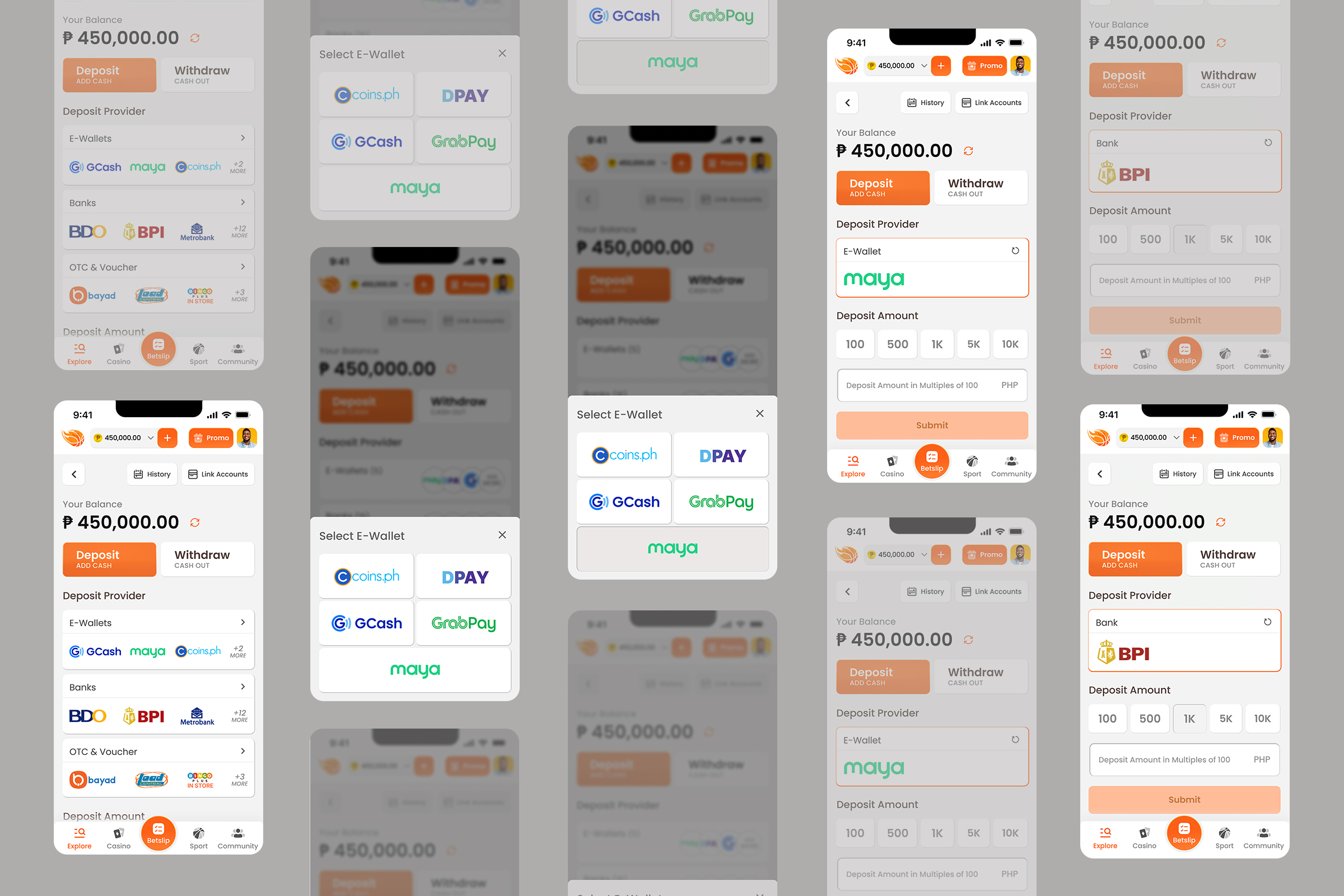
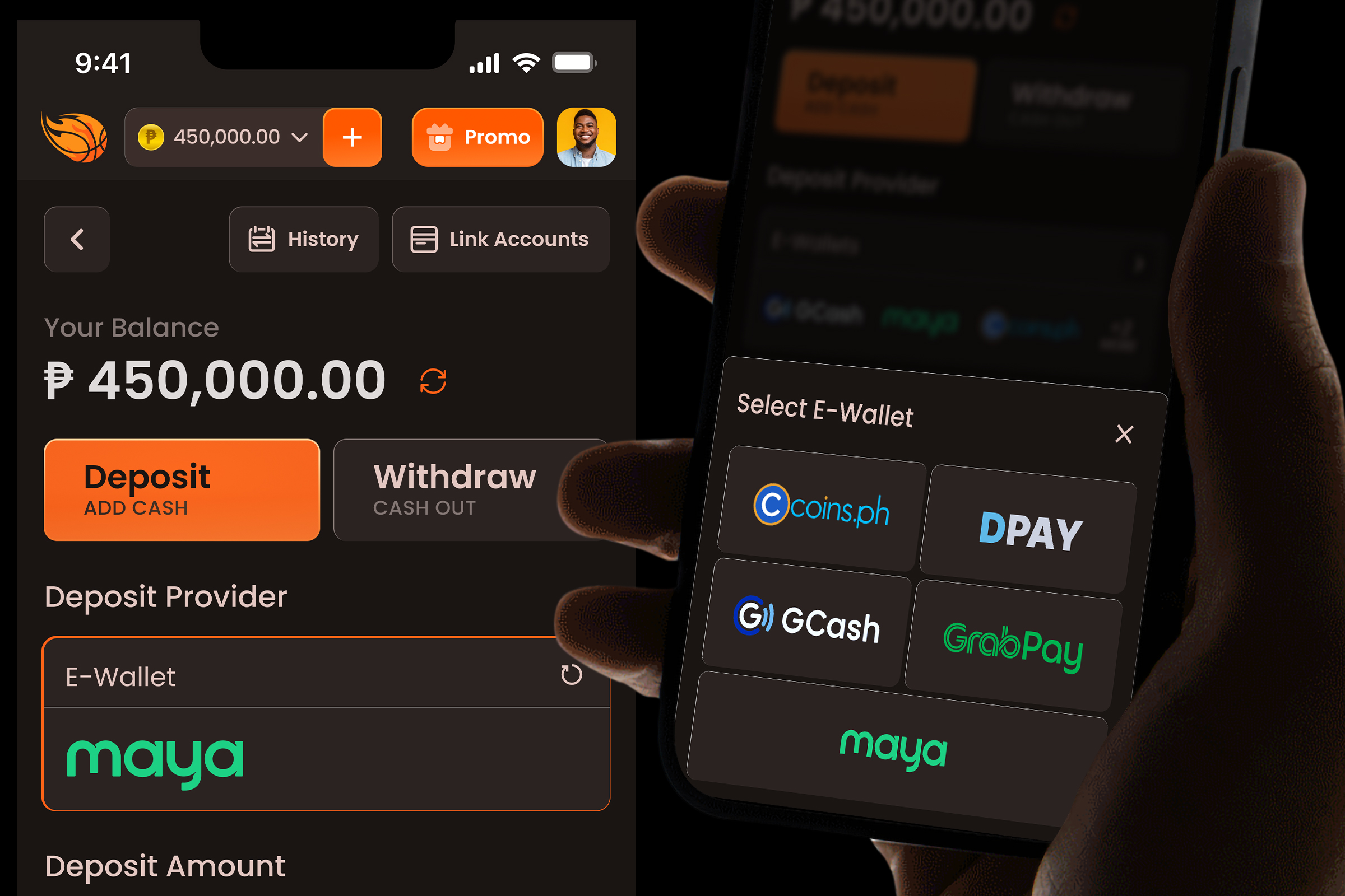
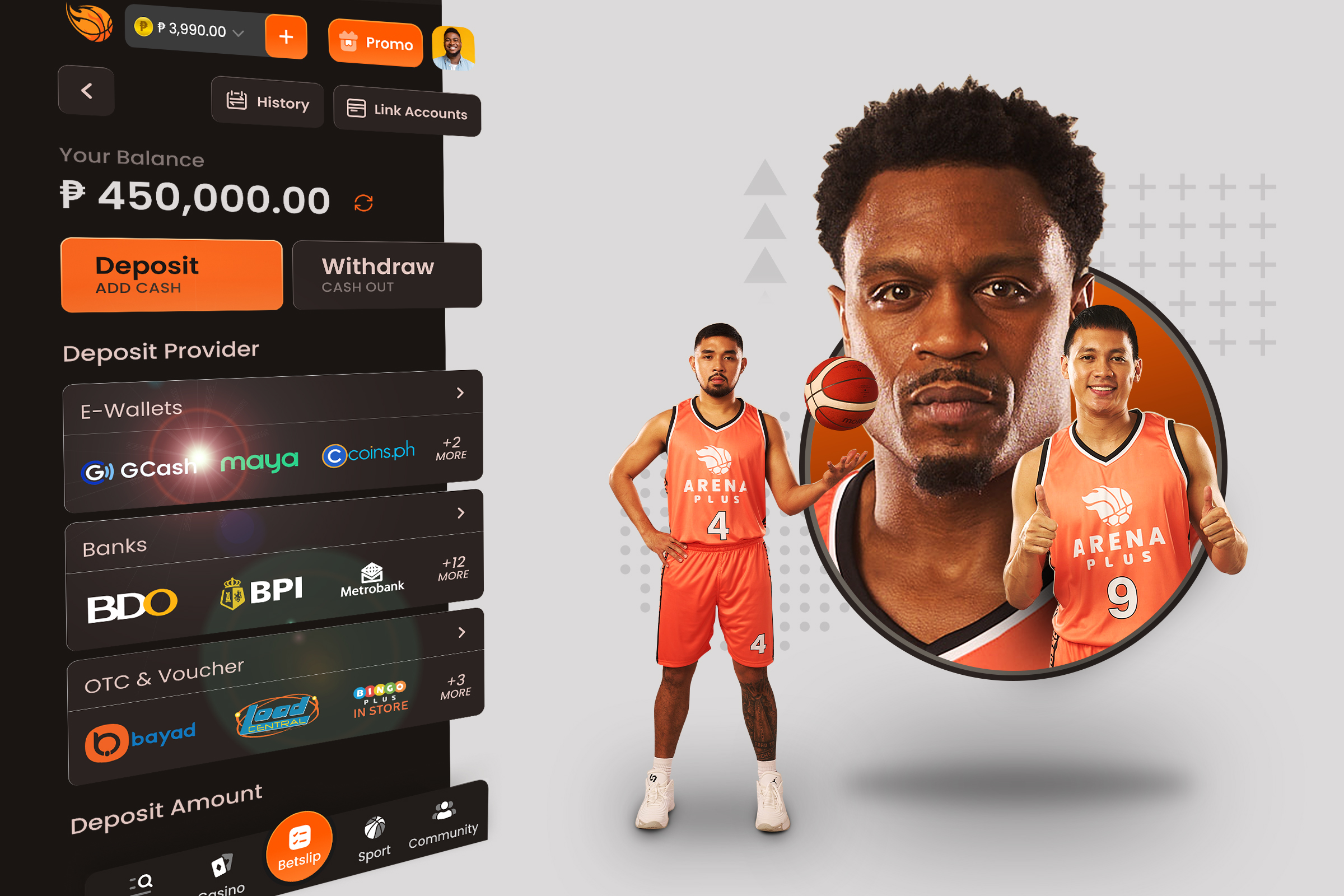
The UX strategy for the wallet is to make it super easy for the user to deposit. The current design includes a lengthy horizontal scroll to access certain providers so we aimed to improve that selection experience. We also wanted the deposit providers to be clearer and more easily decipherable (with the use of full provider logos instead of plain text), make it easy to change the selected provider, and make it easier to enter the deposit amount by having the top 5 denominations as 1-touch options.
Scannability is Key
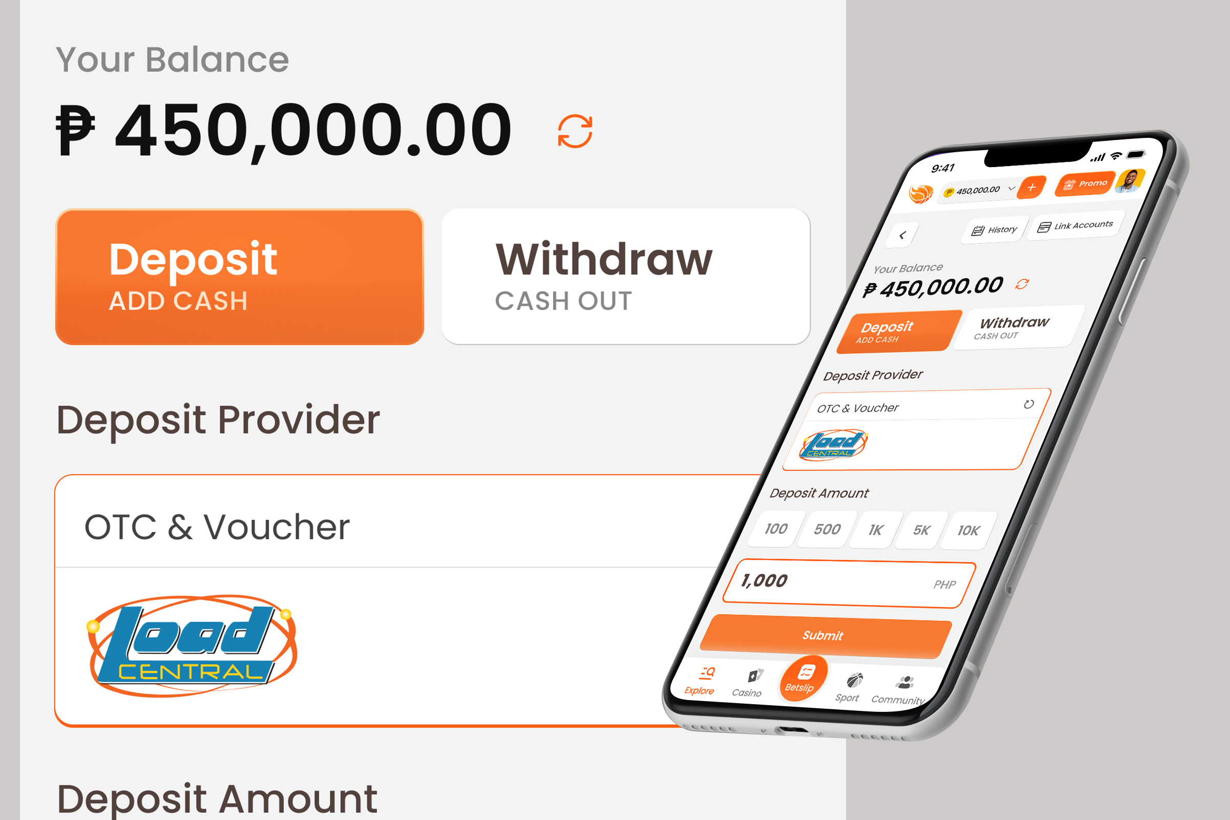
Tab-style navigation works best on desktop. There was also feedback that the horizontal drag/scroll can be problematic on some devices. Doing away with this allows for easier scanning and quicker selection which contributes to a better wallet experience.
Power in Optionality
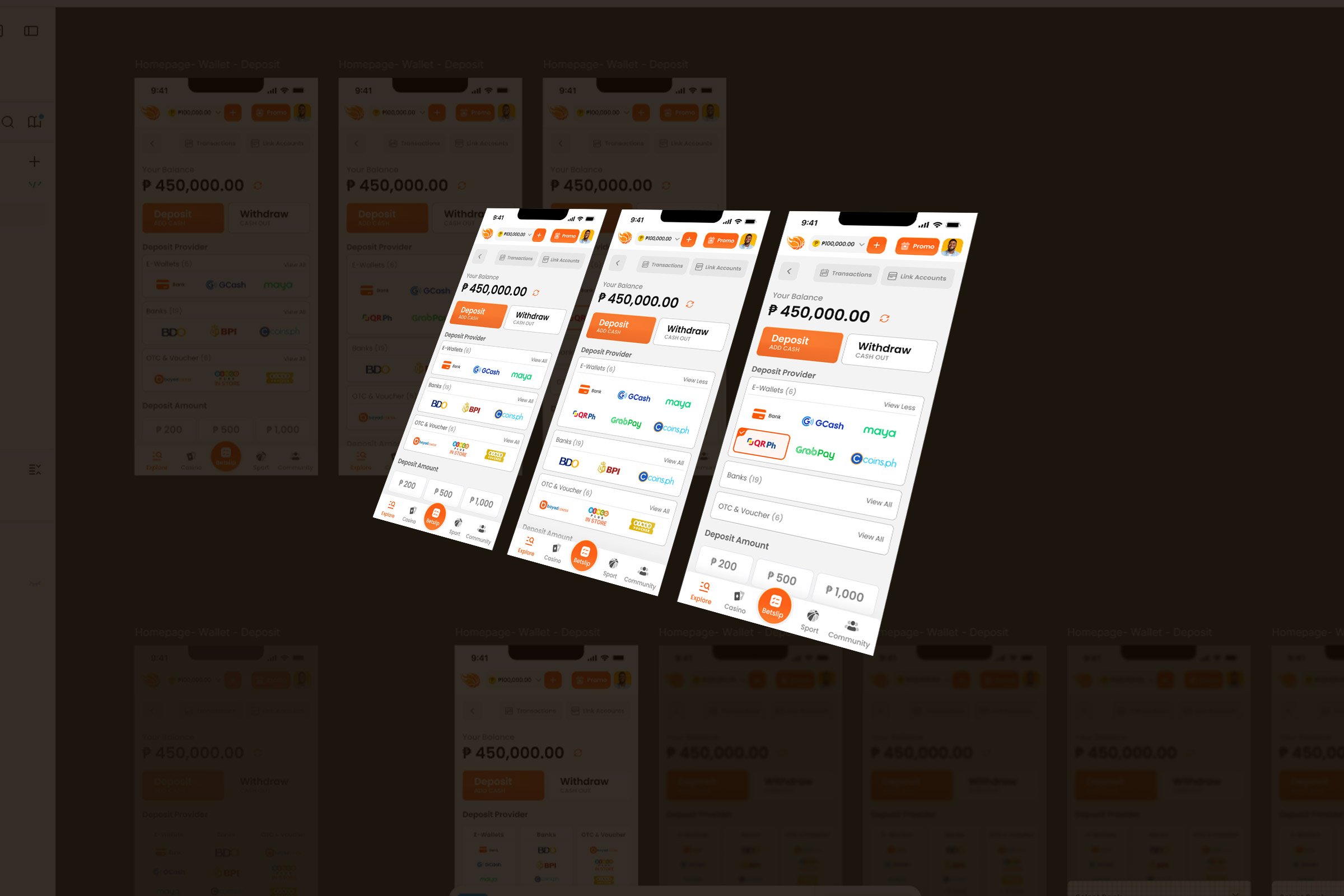
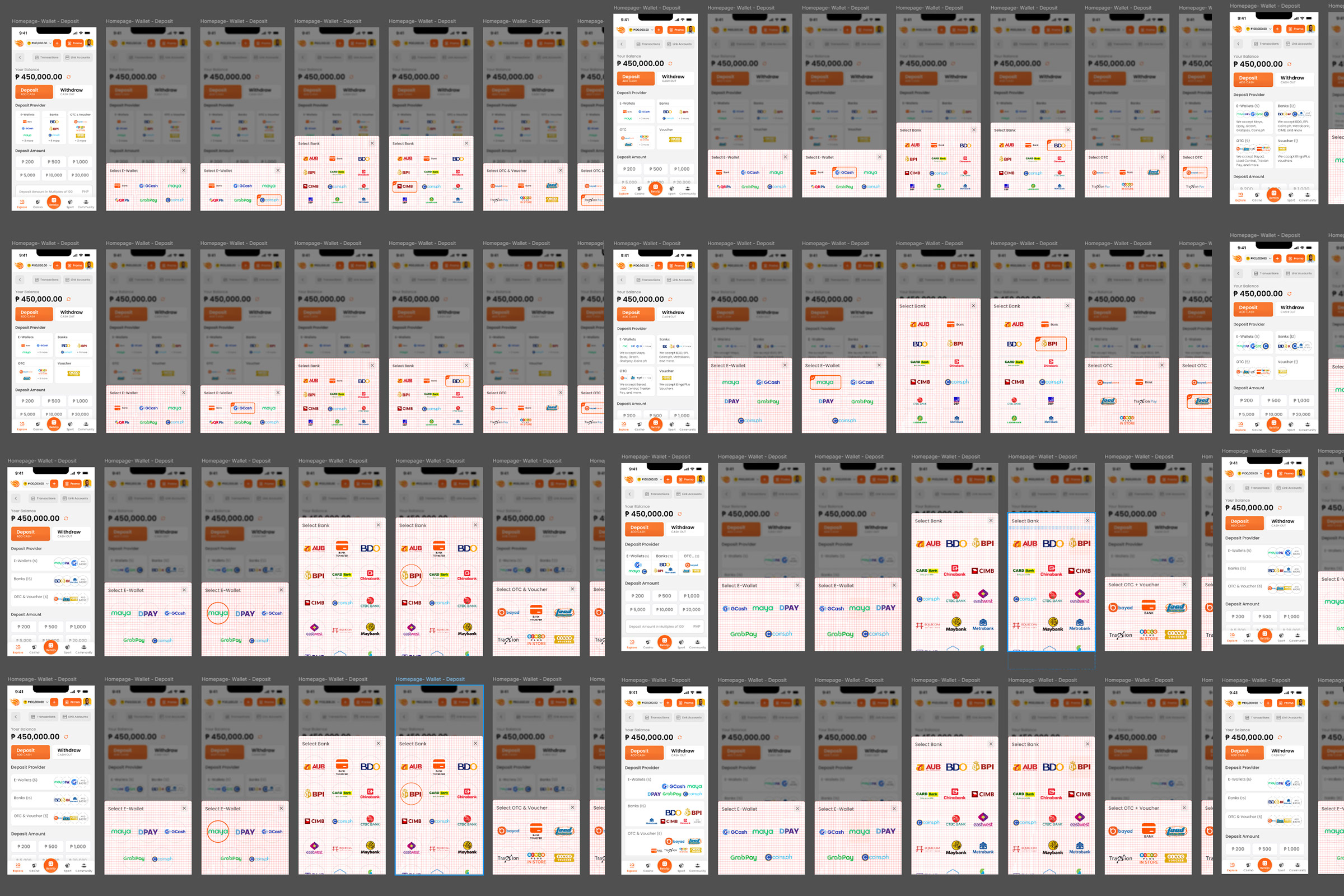
Before I got to the current design, I spent 2 weeks designing over a dozen different options of the provider display, which includes both the preview and the complete provider list. I researched what other apps with similar features were doing and I learned that most of them just cared about looking cool and minimalistic but not caring so much about delivering a quick and easy deposit experience. As a user myself, I wanted the deposit experience for our app to be as smooth as possible. I think the combination of displaying the full logos of popular providers as the preview and employing a modal display for the complete provider list does the job really well. It takes 2 clicks to choose the provider and 5 clicks total to deposit (including deposit verification). We also made sure to use the proper versions of the logos for light and dark mode.
Orange is the New Grey
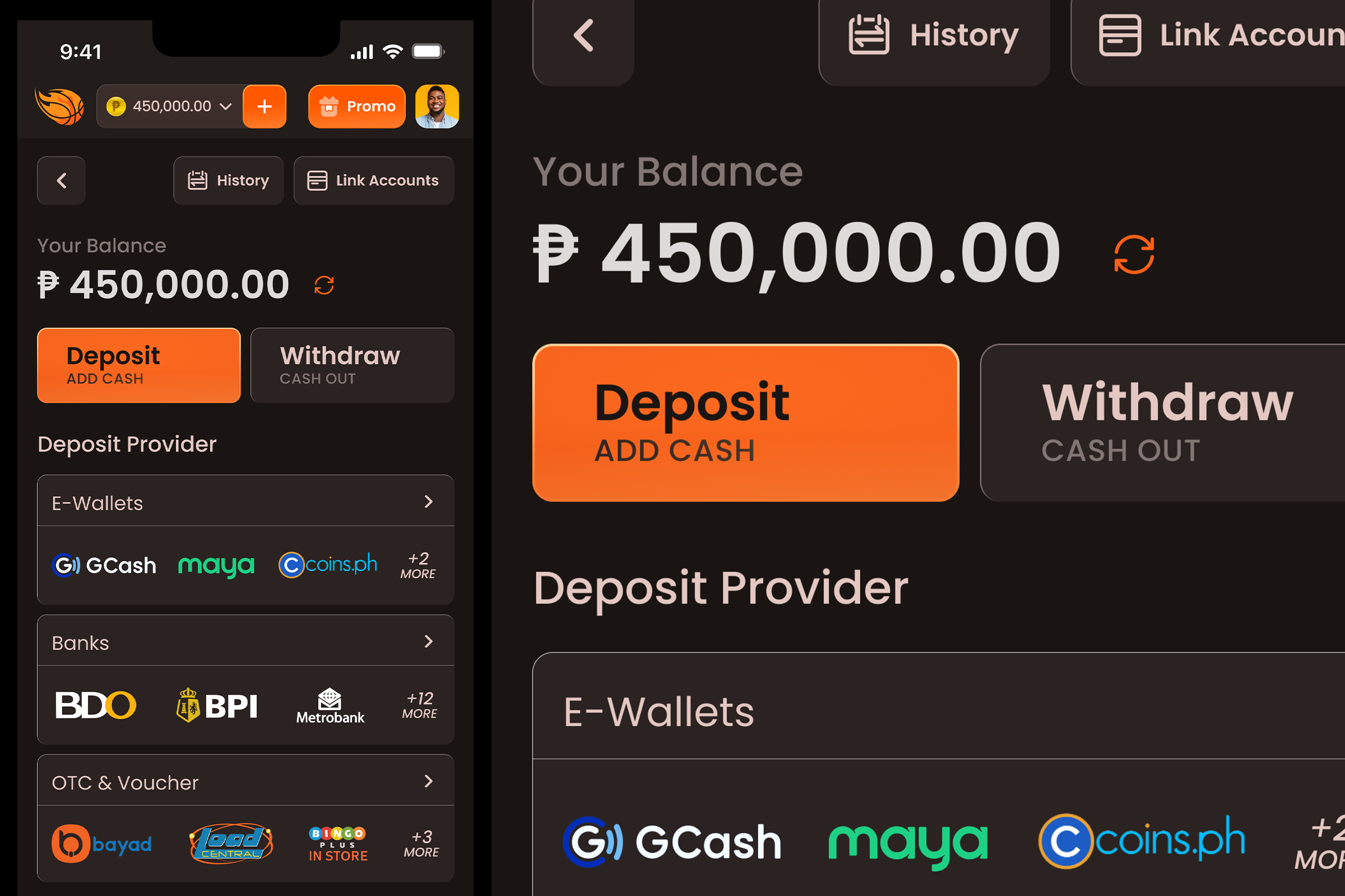
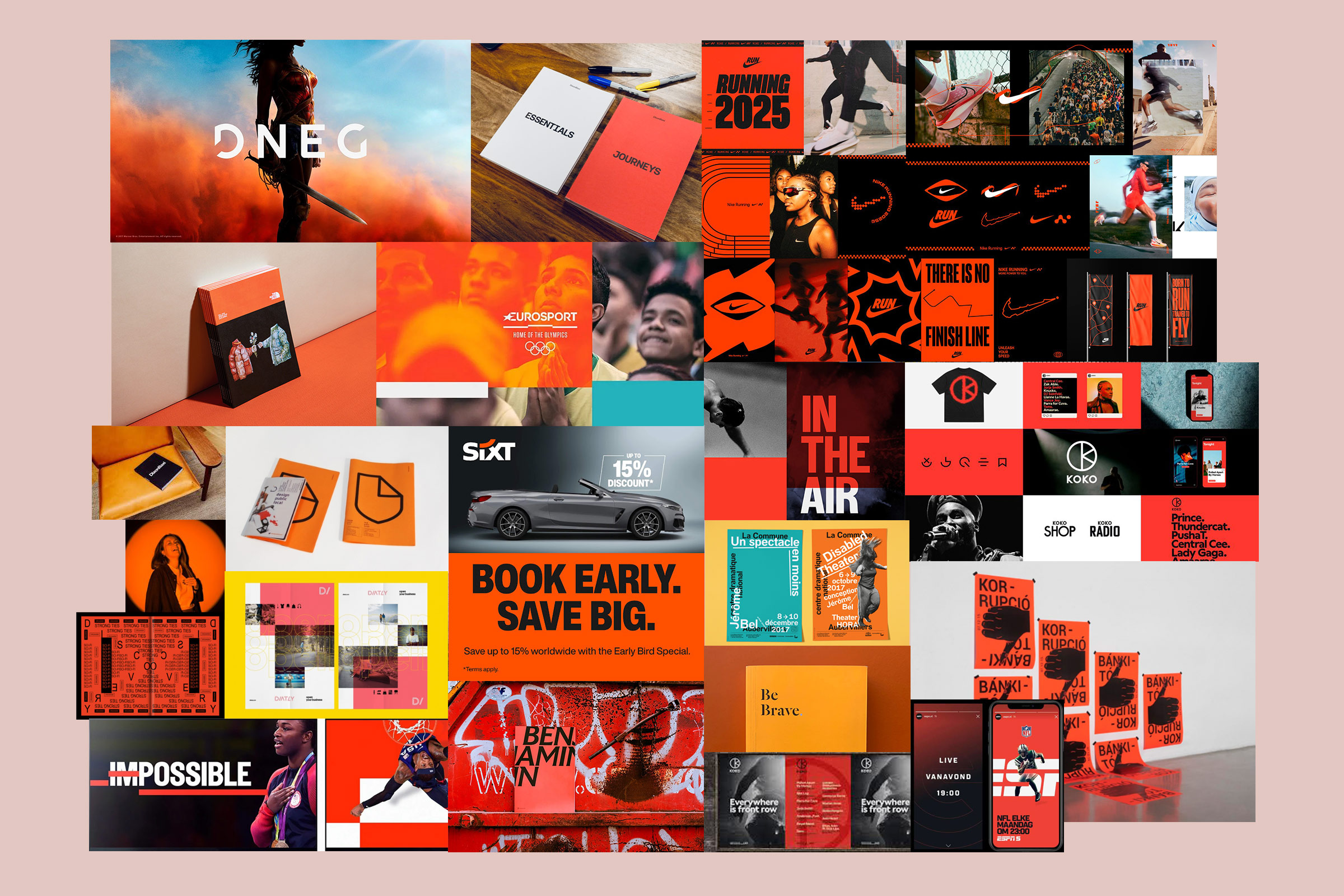
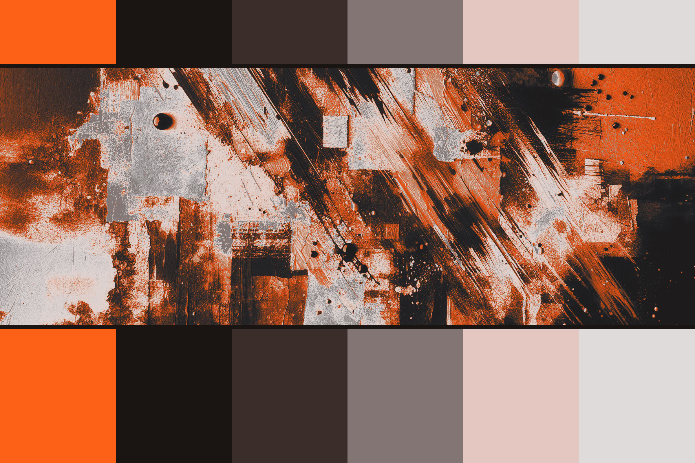
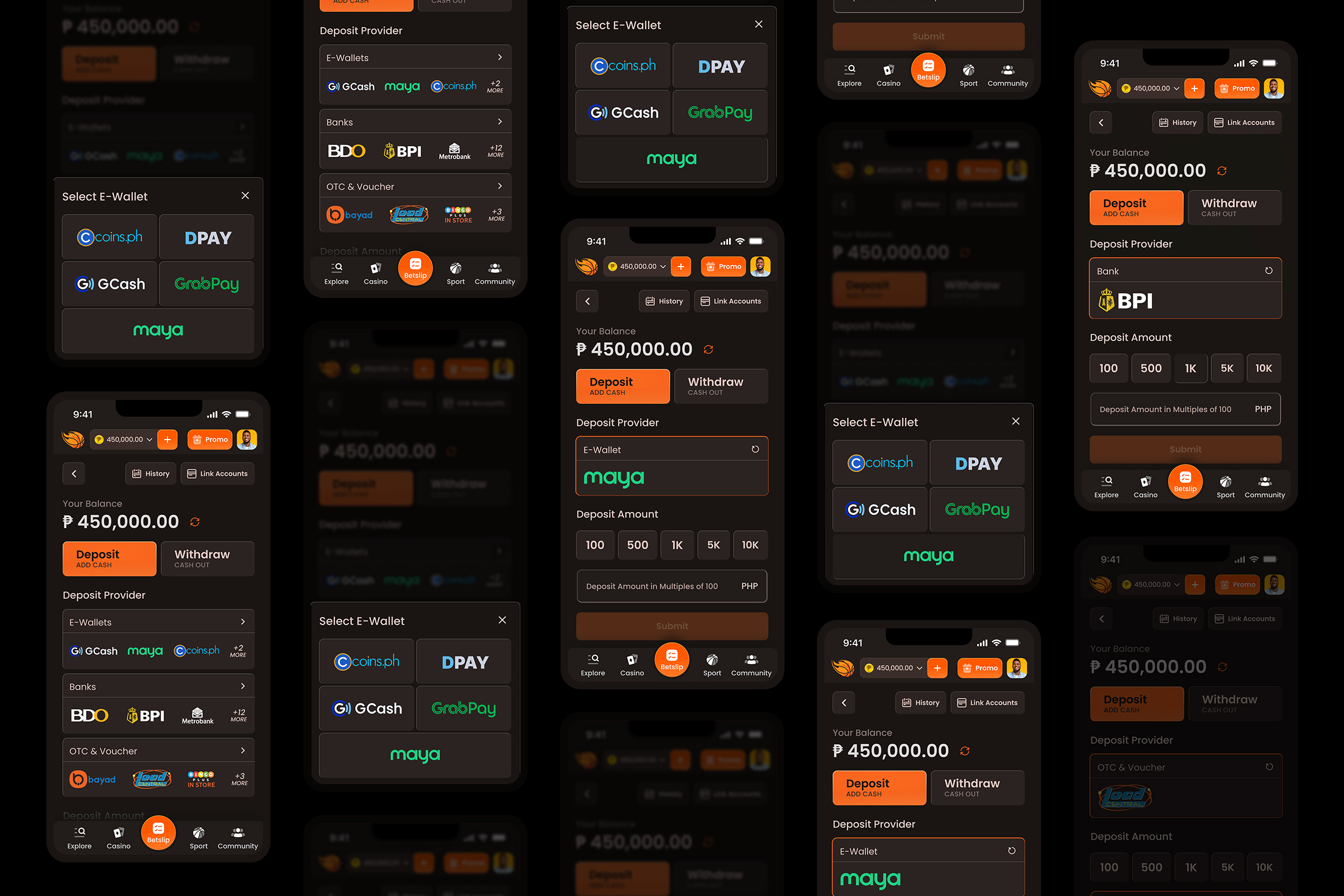
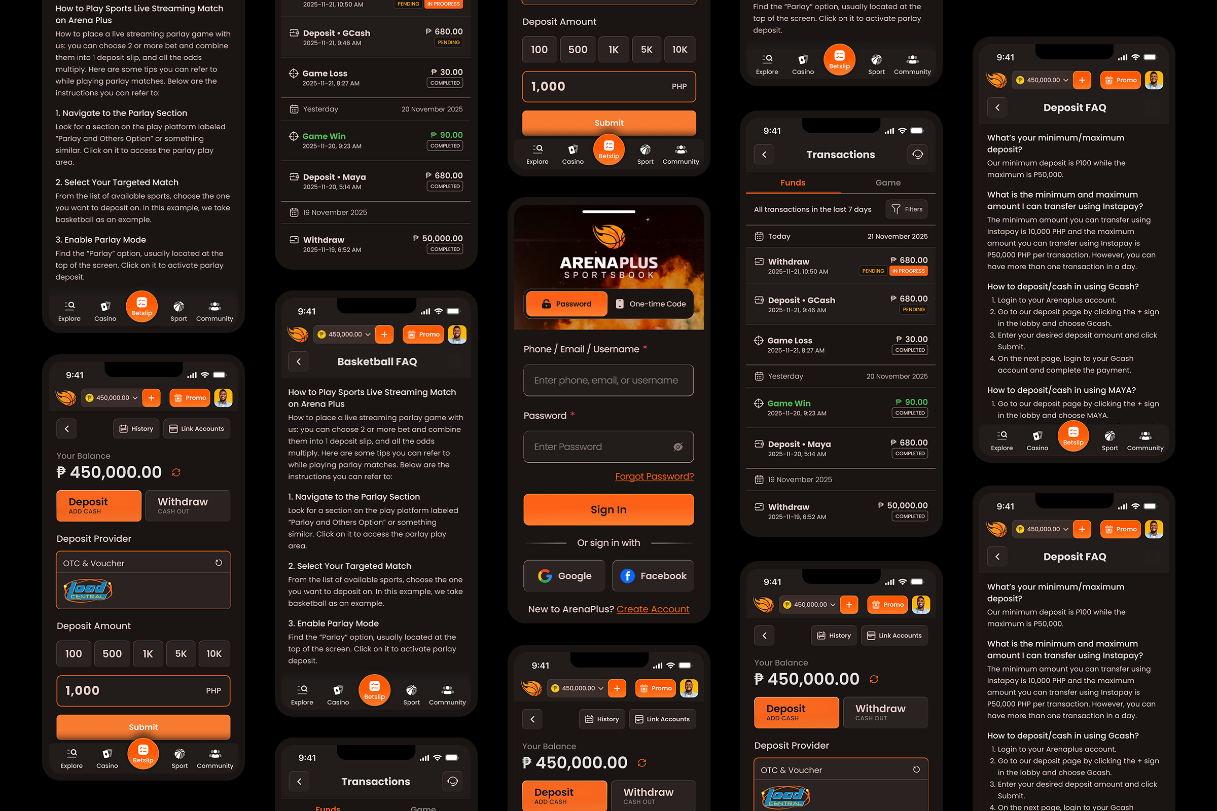
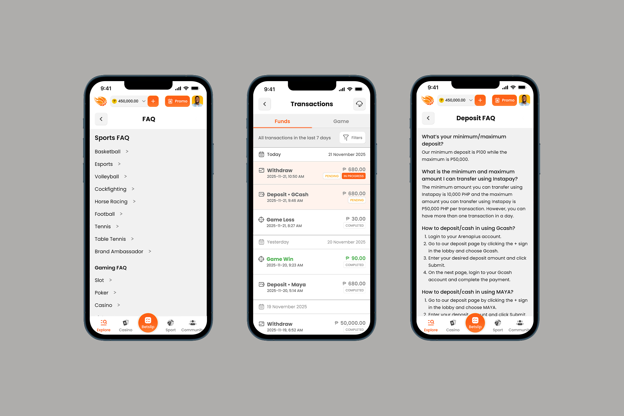
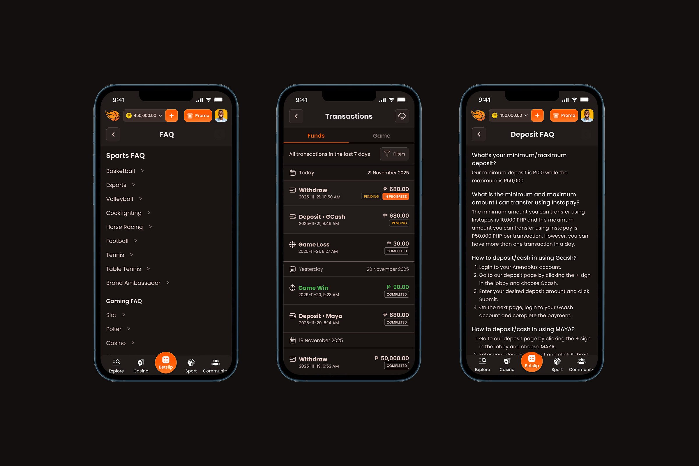
I initially designed dark mode using a drab grey palette (similar to most sportsbooks out there) but I decided to apply an orange tone (which is ArenaPlus' brand color) to the greys to give it a bit of personality and differentiation from the rest of the (sportsbook) pack.
Craft is in the Details
I applied a bevel to the buttons (and a reverse bevel to input fields) to add a bit of depth and separation to these clickable elements. I feel these small details add a touch of sophistication and trustworthiness to the overall product.
On Dynamic Defaults
I suggested the option of having the last used provider as the default option on the next session but we still need to do proper tests since this might induce undue panic on some users (barring the use of an FYI modal as guide). I think there has to be some sort of calming effect to an interface that is consistent versus something that adjusts depending on your usage. Especially with financial apps; I think most would rather be thought of being firm, steady and maybe a bit boring versus being dynamic and trendy. But I do think app users are generally more embracing of change in mobile compared to desktop users who are usually more rigid in their expectations of software.
 Bro Sport
